NFL Playoff Bracket
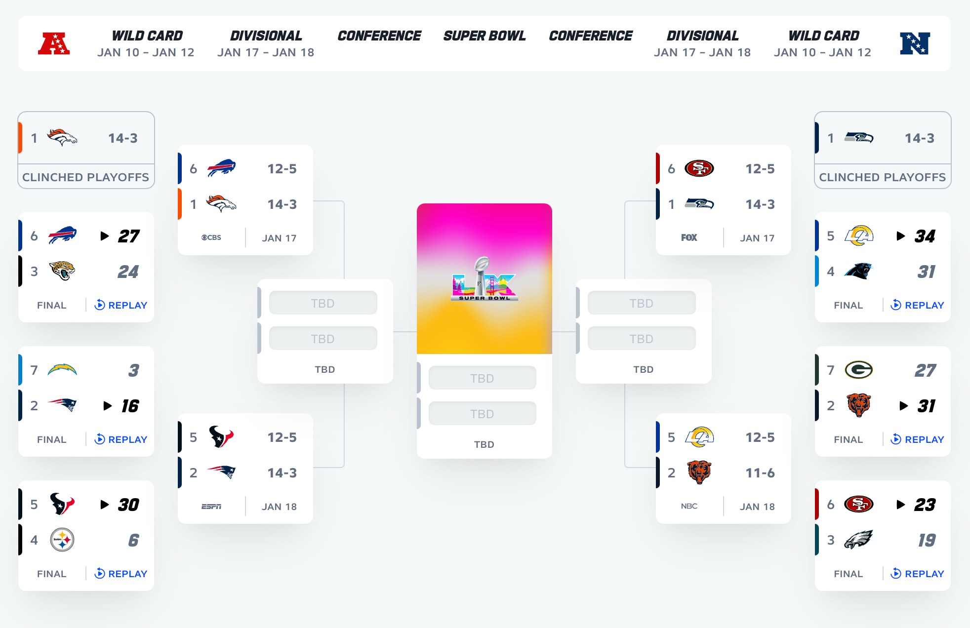
This layout confuses me. I have attached a photo of what NFL.com puts up and it seems easier to read.
the following notes are all just nice to haves so you can reference when sitting around and looking at them.
1. It’s split left and right for conference AFC and NFC.
2. It puts the dates up top and what round it is.
It adds the teams conference rating the left of the team
it add the wins-losses
adds word final to finished games
adds dates to upcoming games
adds tv channel to games
shows division leaders and how the clinched their spot
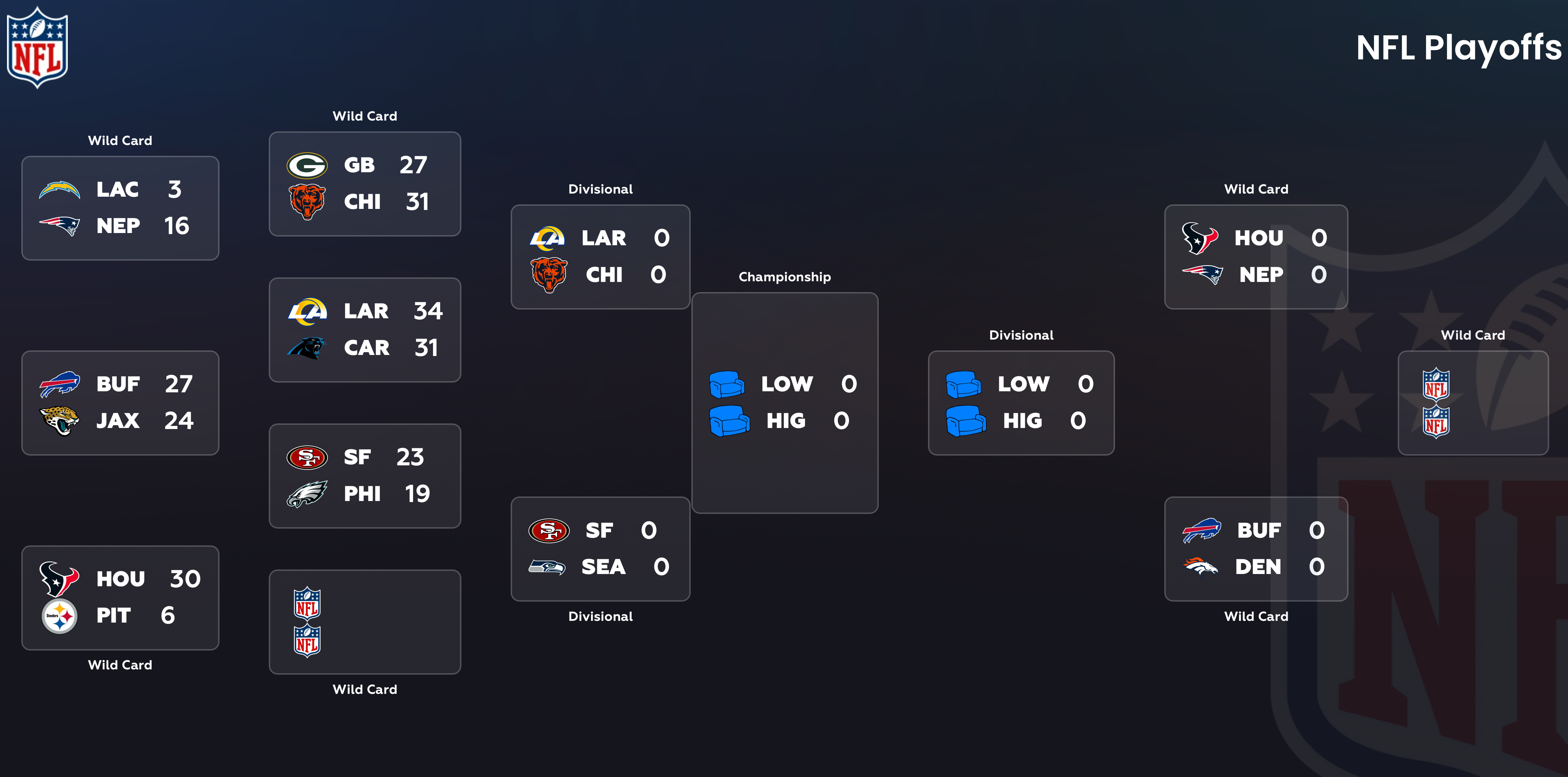
The current layout seems odd without enough information. And the LOW/HIG text should maybe just read TBD?
Please authenticate to join the conversation.
Completed
Bugs
High Priority
4 months ago

John
Subscribe to post
Get notified by email when there are changes.
Completed
Bugs
High Priority
4 months ago
John
Subscribe to post
Get notified by email when there are changes.